More Than Just Metal: Unveiling the Hidden Stories Behind Car Logos
Car logos, those seemingly simple emblems adorning the front of our vehicles, are far more than mere decoration. They're carefully crafted symbols, each a microcosm of a brand's history, values, and vision for the future. From the interlocking ovals of Toyota to the winged arrow of Škoda, these icons whisper tales of engineering prowess, global ambition, and a commitment to the customer.
Unlocking the Secrets Behind Your Favorite Car Bad...
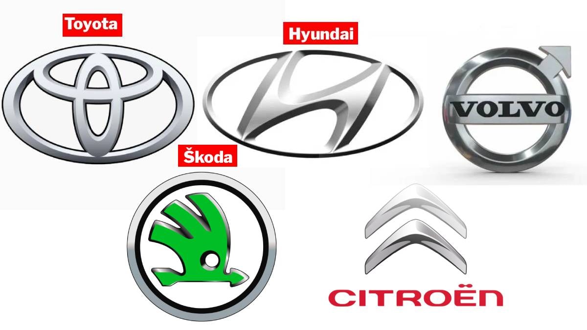
Toyota's iconic three-oval logo, introduced in 1989, is a masterclass in subtle messaging. The two interlocking ovals represent the vital connection between the company and its customers, a bond built on trust and reliability. Cleverly, these shapes also form the letter "T," the brand's initial. The encompassing outer oval symbolizes Toyota's reach on the global stage. But the detail doesn't stop there. The logo cleverly incorporates all the letters of the name "Toyota," showcasing the brand's dedication to meticulous design.
Hyundai's slanted "H" is often mistaken
Hyundai's slanted "H" is often mistaken for a simple initial. However, it represents something far more profound: a handshake between a company representative and a satisfied customer. This visual embodies the Korean manufacturer's commitment to trust, loyalty, and collaborative partnerships, emphasizing the strong relationship they strive to cultivate with their clientele.
The Volvo logo, a circle with an upward-pointing arrow, is steeped in history and symbolism. This ancient alchemical symbol for iron and the sign of Mars represents strength, durability, and, most importantly, safety. This design pays homage to Sweden's rich history in steel production while simultaneously reinforcing Volvo's core value: unwavering safety.
Škoda's "winged arrow," a symbol since 1926, speaks to the brand's ambitions. The arrow itself represents speed and the relentless pursuit of innovation, while the wings symbolize freedom and technological advancement. The circular "eye" within the logo signifies a visionary perspective and precision in manufacturing. The color green adds another layer, reflecting Škoda's environmental awareness and connection to its traditional roots.
The Citroën logo, with its distinctive
The Citroën logo, with its distinctive double chevron, has a fascinating origin story rooted in Poland. Founder André Citroën discovered and patented chevron gear technology in Łódź in the early 1900s. The double chevron serves as a constant reminder of this pivotal discovery and Citroën's subsequent rise to engineering success.
These examples demonstrate that car logos are not just arbitrary designs. They are carefully considered narratives, encapsulating a brand's history, engineering philosophy, and commitment to its customers. Next time you see one of these emblems, remember that it represents a story spanning years, a testament to the power of visual communication.
Comments
Please sign in with Google to post a comment
No comments yet. Be the first to comment!